Scellnetor Docs & Help
SECURITY INFORMATION
Read our documentation below or watch a screencast:
long version:
medium length version:
ultra-short version:
Scellnetor has been updated to work with Scanpy 1.6.0 (29th of February 2021)
This means:
Contents:
- Upload your data
- Select the template-plot
- Draw trajectories or pick clusters
- Parameter selection for constrained hierarchical clustering algorithm
- Inspect and download results
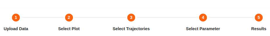
You can simply track your progress when using the web tool and match it with this guide outlines using the progress bar.
1. Input Data:
The input data to Scellnetor must be Scanpy AnnData object in H5AD file format. The H5AD file contains your analyzes, clusterings and plots created with Scanpy. When using Scellnetor, it is a good idea to calculate and store pseudotime of your cells’ differentiation trajectories.
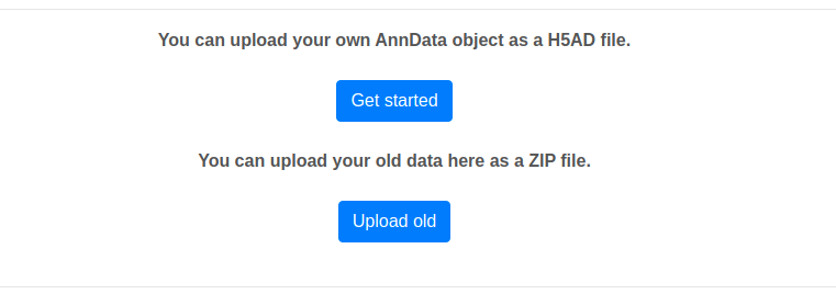
To use Scellnetor you have two options:
1) Click on [Get started] on the home page and upload your desired H5AD file. Here, you can additionally upload your own network as tab separated edge list (nodes should be written using Entrez IDs).
Or you can click on [Upload old] and upload a ZIP file containing Scellentor output files. This allows you to recreate old results or do a clustering with new parameters. If you include a network of your choosing as a tab separated edge list it will be initialized as the one that will be used for the analysis (nodes should be written using Entrez IDs and the file suffix should be ".tab2").
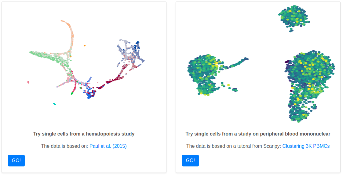
2) Alternatively, you can try out one of our four example data sets. Simply, click on the button [GO!] Below the data set you would like to try. .
2. Select the template-plot and choose network:
2.1. Select the template-plot
Regardless of the option you chose in the previous step, your next step will be generating the template-plot that will be used to draw trajectories or to pick clusters.
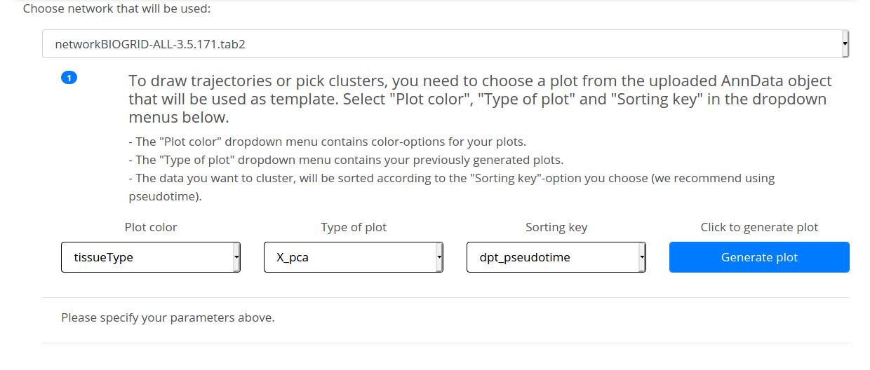
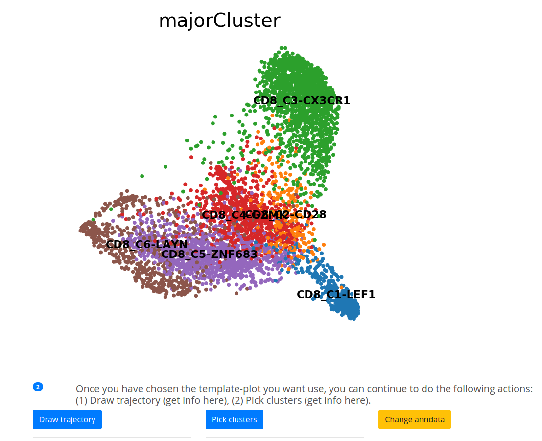
Before generating the plot based on the uploaded AnnData there are some parameters to specify. You need to pick one of the Scanpy-generated plots as a template-plot by specifying three parameters. The drop-down menu options are based on your pre-analysis and they will appear as you name them during scRNA-seq data processing with Scanpy. Here is the meaning of the options that you will see when using our example data set 4.
1) Plot color contains the available color-option for the plot:
[tissueType]: The Single-cell RNA sequencing, in this case, was applied to T
cells derived from CD8+ T-cells in lung cancer extracted from 3 different tissues. Based on this annotation you can color cells by their tissue type.
[cellType]: Cells clustering based on the cells found in the tissue.
[patient]: The data was extracted from 14 patients. Cells can be colored based on the patients that they belong to.
[majorClusters]: Major CD8 cells clusters in the data.
2) Type of the plot to be used:
[X_pca]: This plot is generated when reduceing the dimensionality of the data by running principal component analysis (PCA).
[X_diffmap]: Use the plot that represent the data in a diffusion map space.
3) sorting key:
The data you want to cluster, will be sorted according to the [sorting key] option you choose. we recommend using pseudo-time.
After setting all the 3 parameters, you can generate the template-plot by clicking on [Generate plot]. Now you can [draw trajectories] or [pick clusters].
Note that you can always change & edit your annadata using [Change anndata].
2.2. Choose network
Above the console used to specify the template-plot, you can select the network you wish to use for your analysis. If a network has been uploaded with you data, the name of that network will show instead of the dropdown menu.
3. Draw trajectories or pick clusters:
3.1. Draw trajectories:
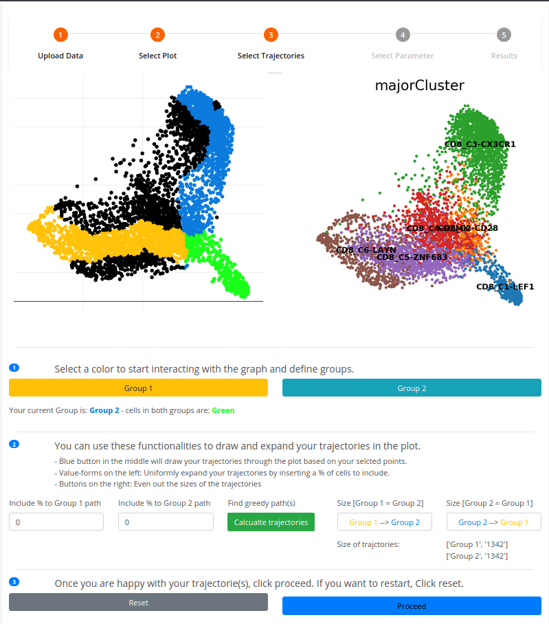
To draw trajectories with Scellnetor The canvas-plot (in black) allows the user to select cells. These cells are then connected by a greedy path algorithm. The order by which you select cells directs the formation of the trajectories.
1. At least two cells are needed before a trajectory or a path can be created. You make two distinct sets on the canvas-plot using the signature colors, amber and navy blue. To choose cells to include in the amber (Group 1) set click on [Group 1] then choose the point in The canvas-plot, the same applies to the navy blue set (Group 2).
2. Before drawing the trajectories, Scellnetor offers some functionalities to expand your trajectories, such that more cells can be included in your analysis.(2.left) a user-defined percentage of cells that neighbor cells in the minimal greedy path for both trajectories (Group 1/Group 2). For optimal comparisons of trajectories, it is recommended that users make trajectories that contain the same or close to the same number of cells.
You generate the trajectories by clicking on [calculate trajectories].
(2.right) This functionality allows users to even out the sizes of their drawn trajectories with respect to their number of included cells.
Once you calculate trajectories and you are satisfied with the results, click on [Proceed]. Otherwise, you can reset all the parameters by clicking on [Reset].
3.2. pick clusters:
The cluster-pick function allows you to draw trajectories based on the clusters annotated in the uploaded data as follow:
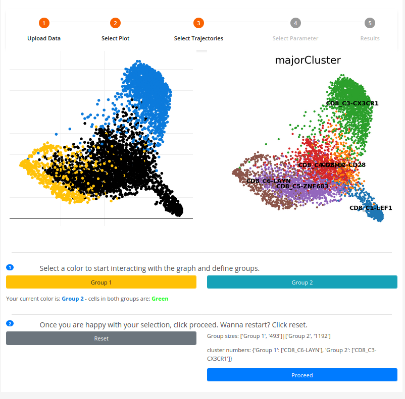
1. You can select cells on the canvas-plot and the cluster to which the cells belongs are colored is in accordance with the chosen color amber/navy blue (Group 1/Group 2).
2. You can switch between colors and choose cells in different clusters until you satisfied with the created two distinct cluster-sets that can be compared by clicking on [Proceed]. Otherwise you can click on [Reset] to repeat the process.4. Parameter selection for constrained hierarchical clustering algorithm:
To perform the constrained hierarchical agglomerative clustering there are a couple of parameters to set up. Here is the meaning of each parameter and the available options:
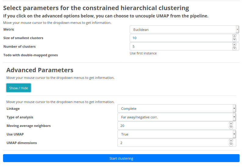
Basic Parameters:
Metric: Allows you to define the UMAP distance metric that is applied to reduce the dimensions of the smoothed gene expression patterns. There are four distance metrics to choose from: Euclidean distance, Manhattan distance, Minkowski distance or Correlation.Size of smallest clusters: You can set the minimum size of the clusters that will be found when comparing two trajectories.
Number of clusters: You can set the minimum size of number clusters that will be found when comparing two trajectories.
Advanced Parameters:
Linkage: In order to perform clustering, it is required to determine the proximity matrix containing the distance between each point using a distance function. Then, the matrix is updated to display the distance between each cluster. You can select among the following three methods:Single Linkage: In single linkage hierarchical clustering, the distance between two clusters is defined as the shortest distance between two points in each cluster.
Complete Linkage: In complete linkage hierarchical clustering, the distance between two clusters is defined as the longest distance between two points in each cluster.
Average Linkage: In average linkage hierarchical clustering, the distance between two clusters is defined as the average distance between each point in one cluster to every point in the other cluster.
Type of analysis: You define whether you want to find clusters that have similar expression in the two sets (Close/positive corr.) or different expression patterns in the two sets (Far away/negative corr.).Moving average neighbors: Replacing a data point with the average of its neighbors. Here the number refers to the number of neighbor points to use.
Use UMAP: Choose whether you want to use UMAP for dimensionality reduction.
UMAP dimensions: If "Use UMAP == True", then you can assign the number of dimensions UMAP should reduce the data to.
5. Inspect and download results:
When Scellnetor has run a clustering, users can download the main results and all data that were produced by the Scellnetor pipeline. The main results are:
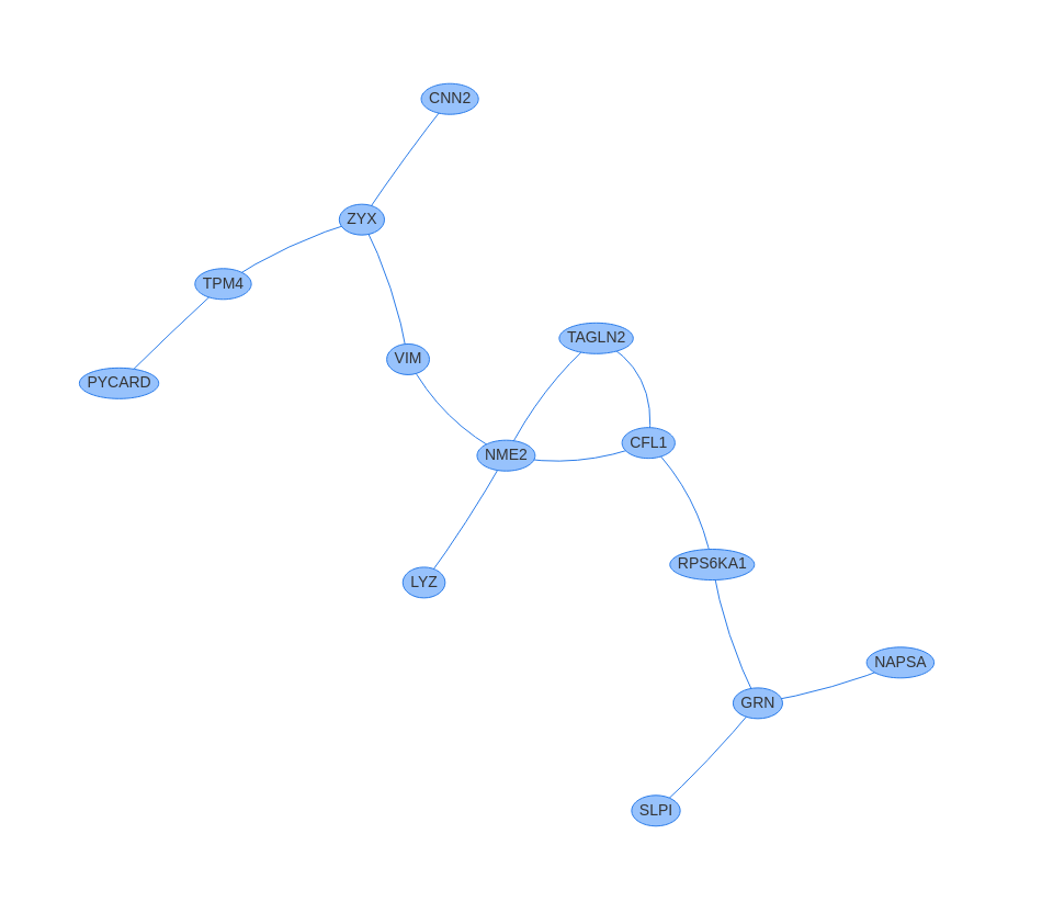
1. Clusters or connected components of genes as PDF files and two edge-tables for every cluster in CSV file format where nodes are denoted as human entrez IDs and human gene symbols, respectively.
2. The mean and 95% confidence intervals of the smoothed gene expression of genes in clusters in PDF file format. They are arranged after the
variable selected as sorting key. The second axis shows “Normalized moving-average-modified gene expression”. It has been normalized such that the highest value of the concatenation of and is 1 and the lowest is 0.
3. TSV files containing statistically significant GO-terms associated with the clusters. It is generated using GOA-tools and that uses Fisher’s exact test to calculate P-values and the Benjamini-Hochberg procedure to find adjusted P-values.
You can download all the files mentioned above by clicking on [Download files].
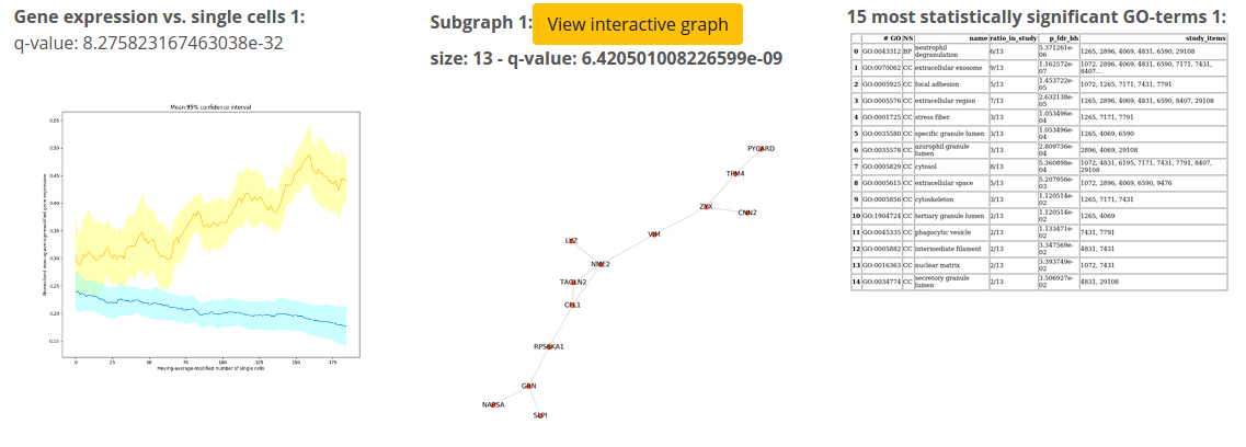
In case you are interested in viewing the generated network graphs in an interactive way, you can click on [View interactive graph] button situated on top of each network.
Scellnetor